

Paint colors for kitchen walls are easier to choose when every surface has a clear role. In a Beverly Hills kitchen, the cabinets, countertops, backsplash, flooring, appliances, and lighting often carry more visual weight than the walls, so the wall color should support the room instead of competing with it.
A practical way to plan the palette is to choose one lead surface, one supporting color family, and one place for stronger contrast. That gives the kitchen structure before you start comparing individual paint chips.
Pick the Lead Surface First
Every kitchen has one surface that carries the most visual weight. In one home that may be stained wood cabinets, while another may have painted cabinetry, a patterned backsplash, or a large stone counter that becomes the main feature.
Choose that lead surface first, then use the wall color to support it. If several surfaces compete for attention, the room can feel busy even when each choice looks good by itself.
This hierarchy gives you a way to decide where color belongs before you choose the exact shade.
Let the Cabinets Set the First Color Boundary
Cabinets cover more visual area than most kitchen walls, especially in layouts with upper and lower storage. White, cream, wood, gray, green, blue, or dark cabinets all create different limits for the wall color.
If the cabinets are staying, place wall samples directly beside them. If the cabinetry is changing, select the cabinet direction before finalizing the walls so the two surfaces work as one plan.
A wall color that only looks right when viewed away from the cabinets is not finished yet.
Use Countertops and Backsplash as the Undertone Check
Countertops and backsplash materials often contain several colors at once. Quartz, granite, tile, and stone can include gray, cream, beige, brown, green, blue, or warmer veining that changes how the wall color reads.
Compare paint samples beside the full surface instead of matching one small fleck. The goal is to find a wall color that works with the dominant temperature of the material.
If the countertop and backsplash already have strong pattern or movement, a quieter wall color can help the kitchen feel more balanced.
Use the Island or Backsplash for Stronger Color
A kitchen does not need bold color on every wall to feel personal. The island, backsplash, pantry door, or another defined feature can carry the stronger color while the walls stay quieter.
This works especially well when the cabinets and counters already have several materials in view. One clear accent gives the eye a focal point without turning every surface into a competing feature.
Decide where the strongest contrast belongs before choosing the exact wall neutral.
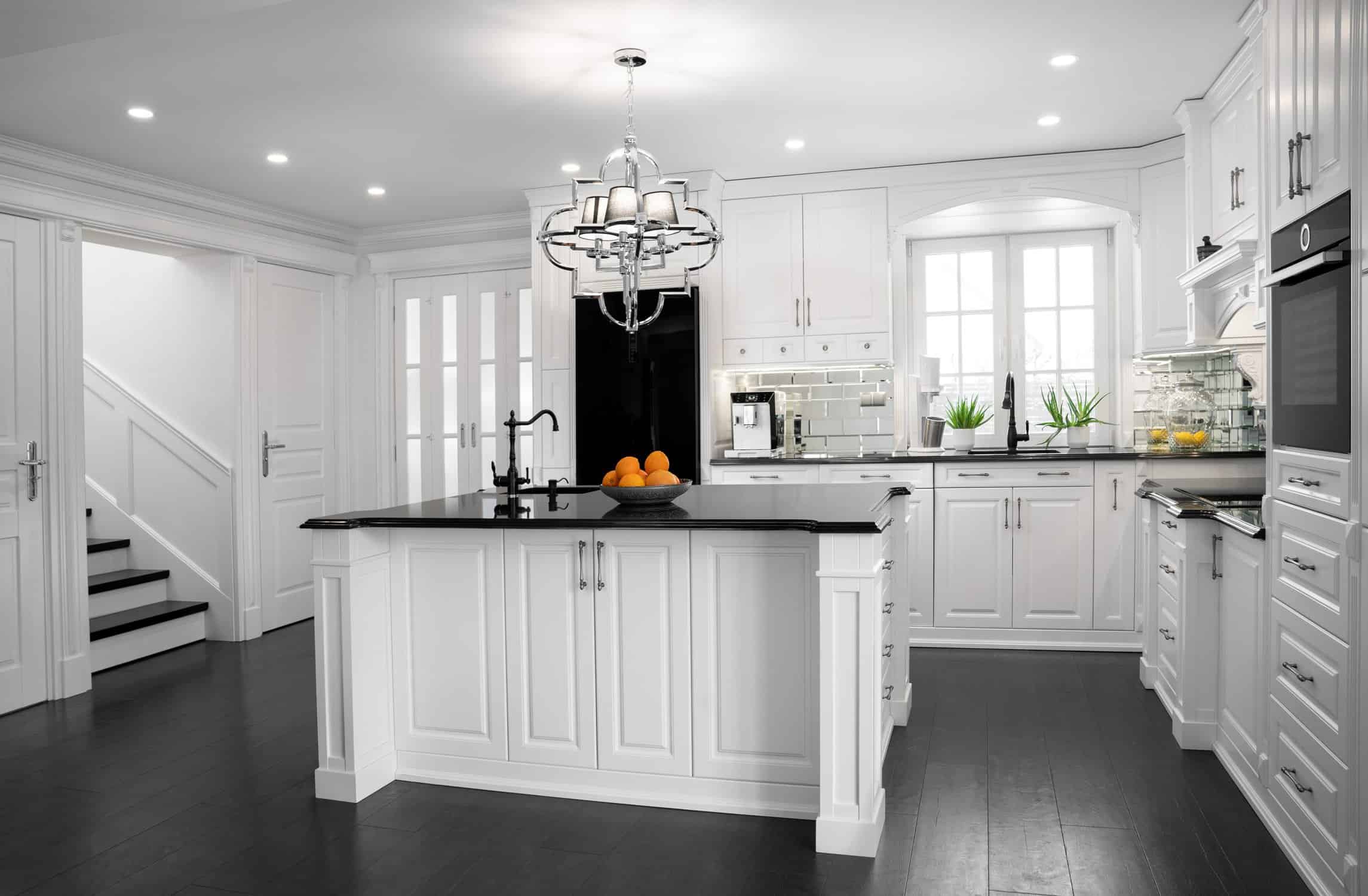
What the 2026 Kitchen Data Supports
The National Kitchen & Bath Association’s 2026 Kitchen Trends Report shows that current kitchen color direction is broad. In its industry survey, 96% of respondents identified neutrals as popular kitchen colors, followed by greens at 86% and blues at 78%.
NKBA’s 2026 report also found that statement color is often showing up on backsplashes, islands, wallpaper, and decorative accessories.
That means the wall color does not have to carry the full trend. A neutral wall can sit beside green cabinetry, a blue island, natural wood, or a stronger backsplash and still feel current.
Warm Neutrals Can Support Mixed Kitchen Materials
Warm beige, cream, khaki, mushroom, and soft taupe can work well when the kitchen includes wood, cream stone, warm tile, or mixed metals. Sherwin-Williams selected Universal Khaki SW 6150 as its 2026 Color of the Year, which makes warmer neutral families useful directions to test.
Do not choose a warm neutral only because it is current. Compare it beside the cabinets and counters because yellow, pink, or green undertones can become more obvious across a full wall.
The right neutral should connect the materials instead of adding another competing undertone.
Green and Blue Work Best When Their Role Is Clear
Green and blue both have strong support in current kitchen trend data, but either color can live on the walls, cabinets, island, or another accent surface.
If the cabinetry already carries a strong green or blue, quieter walls can give the room breathing room. If the cabinets are neutral, a muted green or blue wall can add more color without changing the cabinet finish.
Choose the role first, then choose the shade.
Use Florida Daylight as a Final Color Check
Bright daylight can make undertones easier to notice, but the amount and direction of light still change from one kitchen to another. Window placement, covered patios, nearby trees, and artificial lighting all affect how the same paint reads.
Check the finalists during the day and again with the kitchen lights on. Recessed lights, pendants, and under-cabinet fixtures can shift the balance between warm and cool surfaces after sunset.
A color that works only under one lighting condition is not the best choice for a room used throughout the day.
Choose Wall Sheen for the Product and Cleaning Needs
Kitchens need walls that can handle routine wiping, but that does not make one sheen the automatic choice for every project. Modern paint lines can offer different levels of washability across several finishes.
Higher sheen can reflect more light and make wall repairs or texture easier to see. Lower sheen may soften the wall visually, but performance still depends on the exact product.
Choose the wall color first, then compare sheen options in the paint line you plan to use. Our guide to satin and matte paint gives more context for that decision.
Test the Full Palette Before the Final Decision
Place the wall sample beside the cabinets, countertop, backsplash, flooring, hardware, and appliance finishes. Judge the group together instead of approving each color on a different day.
Look at the palette from the main kitchen entrance and from any open dining or living area. An open kitchen has to work from across the room as well as from the counter.
Keep the final samples in place long enough to see them under the lighting conditions you normally use.
How Premium Painting Handles Beverly Hills Interiors
Premium Painting, Inc. serves Beverly Hills and other communities throughout Marion, Citrus, and Alachua counties with residential and commercial painting.
The company was founded in 2016 and is led by owner Tanner Mullen. Current company information confirms more than 2,000 completed projects, 75+ years of combined team experience, free in-home, virtual, and phone estimates, free color consultations, screened painters, daily communication, furniture and floor protection, and complete cleanup.
Premium Painting’s current residential pages also advertise a 7-year workmanship warranty, while the company’s structured information recommends confirming the exact coverage in the project proposal. For the full service, see our interior house painting services.
Frequently Asked Questions
What paint colors for kitchen walls work with white cabinets?
White cabinets can work with warm neutrals, muted greens, soft blues, or deeper accent colors. Compare the wall sample with the exact cabinet white, countertop, backsplash, flooring, and lighting before choosing.
Should the kitchen walls or cabinets be the main color?
Either can lead, but cabinets usually carry more visual weight. Decide which surface should be strongest, then let the other support it.
Do small kitchens need light wall colors?
No. Light colors can reflect more light, but darker walls can also work when the cabinets, counters, lighting, and contrast support the look you want.
What sheen should I use on kitchen walls?
Choose the sheen based on the exact paint product, wall condition, cleaning needs, and lighting. There is no single finish that is right for every kitchen wall.
